Concept selector
Inputs
Product Grounding
Concept Tailoring
Ad Generation
Product page URL
https://www.spacegoods.com
Extract product

Spacegoods
spacegoods.com
Unlock Your Full Potential
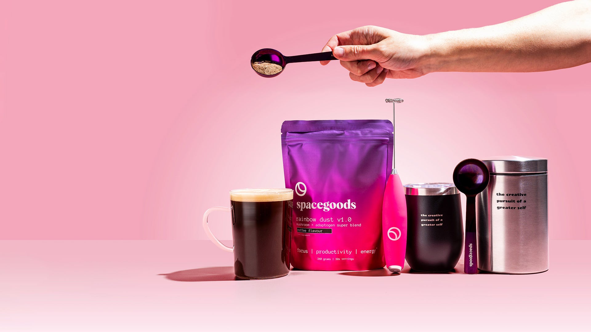
Spacegoods offers all-in-one functional super blends designed to help you feel and perform your best. These blends are formulated with functional mushrooms and adaptogens to provide benefits like focus, energy, and deep sleep. The products aim to upgrade daily rituals like coffee and offer convenient, effective solutions for enhanced well-being.
Supports focus, energy & mental performanceNo jitters, no crashProven formulas backed by scienceGreat taste, no chalky textures or earthy aftertaste+4
 Gemini 2.5 Flash
Product
Images
Logo
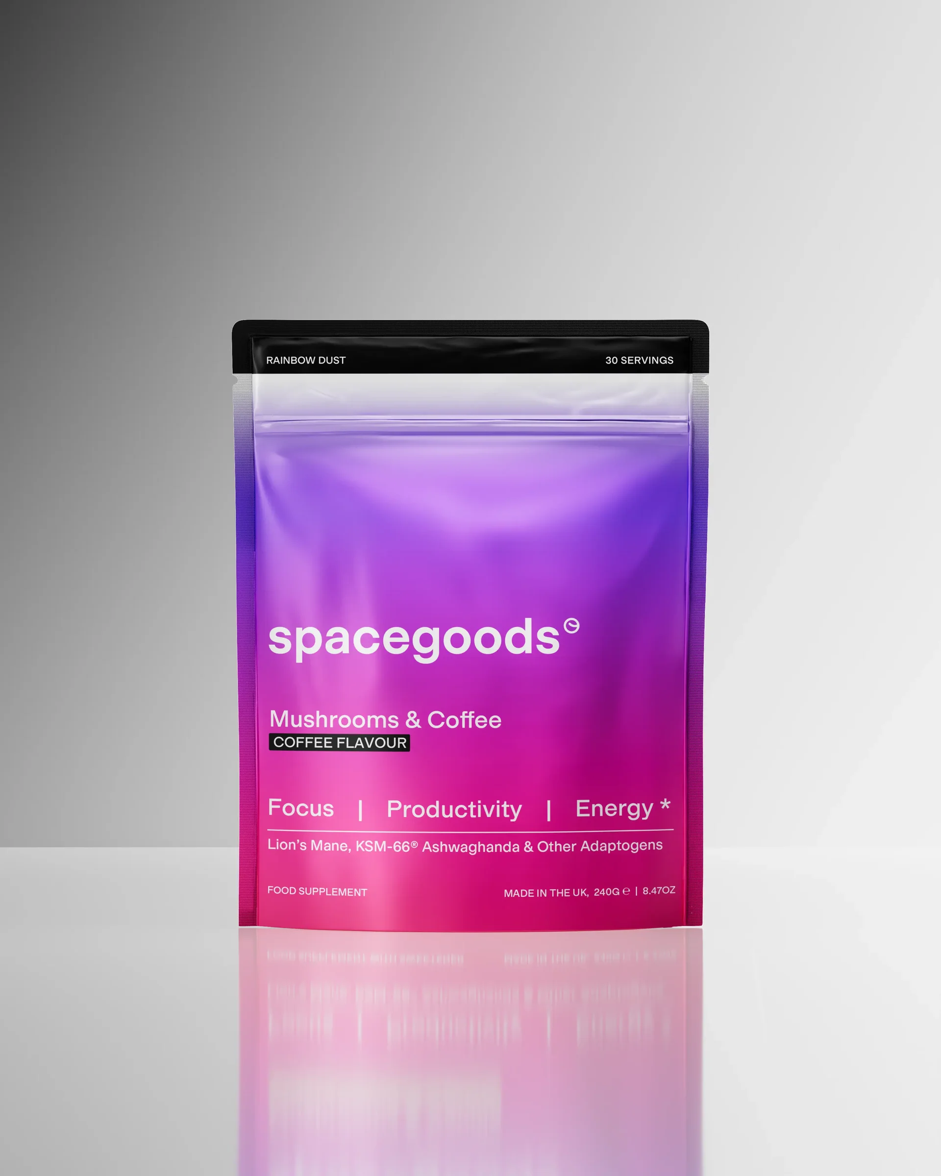
Product image
Concept library
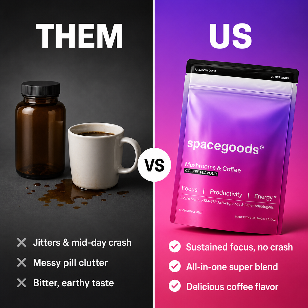
US VS THEM
50/50 split-screen competitor comparison. Left "THEM" half is greyscale (charcoal-to-grey gradient) with a dull generic product and three pain points marked with grey ✕ circles; right "US" half is vivid brand color with the hero product slightly tilted and three ✓ benefits. Thin 2px white center divider with a circular "VS" badge at the midpoint; bold geometric sans-serif, mirrored sizing on both sides.
---
HAND-DRAWN ANNOTATIONS
Editorial golden-hour lifestyle photo (hand holding the product, label to camera) overlaid with hand-drawn marker: 3-4 wobbly black arrows from short handwritten callouts to product features, a loose circle around the wordmark, URL scrawled bottom-right with wobbly underline, product name in emphatic lettering up top. Ink shows bleed, varied pressure, and one brand-color accent — organic, not vector-perfect.
---
IMESSAGE CONVERSATION
Faithful iMessage screenshot: iOS status bar, first-name contact header, grey/blue bubbles with correct radii and a "Today 9:47 AM" separator. 4-6 casual lowercase messages where one friend recommends the product, ending with a photo-attachment bubble of the product and a link-preview card with URL and thumbnail. Delivered/read receipts and input bar included; phone screen floats on soft neutral padding.
---
MAGAZINE COVER
Glossy fashion/wellness magazine cover: bold fictional masthead, issue/date line, barcode in the corner, hero-lit product dominating center as the cover star. Overlapping punchy cover lines — one main feature headline, one "exclusive interview" teaser with brand and URL, 3-4 smaller fake-article teasers. Editorial serif/condensed-sans typography mix, slight print grain and paper texture.
---
SPOTIFY NOW PLAYING
Faithful Spotify dark-mode player replica: the product is the album art, product name as track title, brand as artist, progress bar ~40% played with a playful total time (e.g. "forever"). Queue lists 4-6 benefits as upcoming track names with durations; standard playback controls and ambient color-blur background pulled from the product's dominant color. Premium, on-repeat metaphor.
---
PAIN-POINT CHECKLIST
Vertical stack: big diagnostic question headline ("Sound familiar?" energy) over a checklist of 4-5 relatable pain points, each with an imperfect hand-drawn empty checkbox. A divider or downward arrow breaks to the bottom section where the product appears as the solution with a bold resolution line and URL. Mix of bold sans-serif headline and marker-script or clean sans list items.
---
REDDIT THREAD
Faithful Reddit screenshot: believable category subreddit, a genuine-sounding recommendation-request post with 2-3 lines of self-deprecating body text, then a comment section where the gilded top comment (thousands of upvotes) organically recommends the brand with specifics and the URL. 2-3 replies agree ("came here to say this"). Accurate Reddit UI — upvote orange, comment grey. Earned-trust aesthetic.
---
WHAT'S IN MY BAG FLAT LAY
90° top-down flat-lay of an open bag (tote, duffel, handbag — audience-dependent) spilling 6-10 curated lifestyle items with the product as centerpiece. Every item gets a hairline leader line to a minimal 1-3 word label; the hero product's label is bolder and carries the brand name. Soft top-down light, warm editorial grade, identity-signaling props (book, sunglasses, keys, scrunchie).
---
GIANT STAT
One oversized benefit statistic fills 40-50% of the canvas in heavy display type, with a 5-10 word clarifying line beneath. A single minimal data-viz element (bar, donut segment, or line graph) in brand colors reinforces it; the product tucks into a bottom corner at ~20-25% scale. Apple-keynote-meets-McKinsey mood: confident, editorial, data-driven.
---
STOP SCROLLING PATTERN INTERRUPT
Billboard-style pattern interrupt: solid saturated full-bleed brand color, with a massive 3-8 word emotionally charged hook filling the top 60-70% in heavy display sans. A stark break element (hand-drawn arrow, divider, or giant punctuation mark) leads to the product below with a short 3-6 word resolution line. Strict type hierarchy — huge hook, bold answer, tiny URL; zero decoration.
---
REACTION MEME
Classic two-panel reaction meme (Drake-style, Distracted Boyfriend, etc.): rejected panel shows a desaturated generic competitor/pain scenario with a negative reaction; chosen panel shows the product with an approving reaction. Bold white Impact-style captions with black outline, 3-6 words per panel; subtle brand-color panel borders. Feels native to the feed, not advertorial.
---
BILLBOARD IN THE WILD
Photorealistic environmental shot of the brand's ad as a huge real-world poster — NYC subway platform, Times Square digital billboard at dusk, or bus shelter. The in-scene poster carries the hero product, wordmark, short tagline, and URL in brand colors; urban realism sells it (poster reflections, commuter motion blur, tile grime, shallow depth of field). Slight upward wide-angle for scale; "this brand has arrived" energy.
---
WEATHER FORECAST APP
Weather-app UI replica where the forecast describes the product's effects: brand name as the "location," a big hero temperature/status metric, then a 5-7 block hourly or daily strip whose entries are benefits in forecast language ("Zero chance of brain fog"). Custom benefit icons stand in for weather symbols; sky-gradient background in brand colors; the product appears as a "source" card or station logo.
---
FOUNDER'S HANDWRITTEN LETTER
Overhead shot of a creased cream stationery sheet carrying a genuinely handwritten 4-8 sentence founder letter — first-name intro, why they made the product, warm sign-off with signature and an "x". Real-handwriting imperfections (crossed-out words, margin doodle, ink bleed). Product beside the letter with a pen, branded envelope, and dried botanical; warm window light, film flat-lay aesthetic; URL handwritten below the signature.
---
SCRATCH-OFF LOTTERY TICKET
Realistic scratchcard tilted overhead with drop shadow, printed in brand colors with the wordmark as the lottery game name. Grid of 3-6 scratch panels in varying states — revealed benefits/icons, one "WINNER" panel, one showing the product as the prize, some still coated silver. Serial number, barcode, fine print with URL, and scattered metallic scratch flakes for tactile realism.
---
MUSEUM EXHIBIT
Photorealistic gallery scene: the product alone on a white/concrete plinth under a dramatic overhead spotlight against a neutral museum wall. Beside it, a curatorial plaque styled like a real museum label — artist/title attribution, origin year, a 3-5 line pretentious-but-compelling curator description of the product's "cultural significance," and a "courtesy of" URL credit. Reverent, artifact-worthy mood.
---
VIRAL TIKTOK SCREENSHOT
TikTok interface replica framed on neutral padding: top 60% is a UGC-style video still of a creator or hands with the product, overlaid with handle, punchy caption with hashtags, music attribution, and the right-side action rail. Engagement numbers read viral (millions of views/likes); bottom 40% stacks 3-5 enthusiastic comments with avatars and like counts. URL lives in bio line or pinned comment.
---
DATING APP PROFILE
Hinge/Bumble profile card where the product is the match: product name as first name with founding year as "age," location/bio tag, the product as a flatteringly lit main profile photo, and 2-3 answered prompt cards in flirty dating-profile voice revealing benefits. Iconic swipe buttons at the bottom — greyed-out X on the left, highlighted brand-color heart on the right. Cheeky and self-aware.
---
BENEFITS RECEIPT
Overhead shot of a curled thermal receipt at a slight tilt: brand header in monospace thermal print, dashed dividers, then 5-7 "benefits received" line items each with a whimsical price, subtotal/tax rows, and a meaningful TOTAL ("priceless"). Barcode, thank-you footer, URL repeated; faded characters and smudges for realism. Product and props (coffee, branded bag) styled alongside; warm film-look light.
---
CROSSWORD PUZZLE
Overhead shot of a partially solved newspaper crossword (roughly 10x10-13x13 grid) where 5-8 handwritten answers spell benefits, ingredients, and the brand name — the longest answer featuring the product. ACROSS/DOWN list with playful cryptic clues, newspaper-style header ("The [Brand] Daily Crossword"), pencil and coffee-ring props, warm morning light. Cozy analog-nostalgic mood with a "sponsored by" URL credit.
Split concepts
20 segments
Tailor concept to product
A high-end, top-down overhead flat-lay photograph of a cozy morning ritual scene on a rustic dark wooden table, bathed in warm, golden morning sunlight. In the center of the frame is a vintage-style cream newspaper page featuring a crossword puzzle titled "The Spacegoods Daily Crossword" in elegant, classic black serif typography. The 11x11 crossword grid is partially solved with realistic, slightly imperfect handwritten blue ink letters spelling out "SPACEGOODS" horizontally across the middle, with intersecting vertical words "FOCUS", "ENERGY", and "LIONS MANE". Below the grid, neat printed columns list the clues: "ACROSS: 1. All-in-one functional super blend (10); 4. Sharp mental clarity (5)" and "DOWN: 2. Sustained vitality with zero jitters (6)". Resting diagonally on the page is a classic yellow wooden pencil with a pink eraser, and a faint, light brown circular coffee ring stain marks the corner of the paper. Lying neatly next to the crossword is the exact product pouch from the reference photo: a matte resealable stand-up pouch with a striking color gradient shifting from deep violet purple at the top to vibrant magenta pink at the bottom, crowned with a solid black seal strip. The white lowercase wordmark "spacegoods" is clearly printed on the pouch, along with the text "Mushrooms & Coffee" and "Focus | Productivity | Energy". A tiny, clean footer at the bottom of the newspaper page reads "Sponsored by spacegoods.com". The overall mood is analog, nostalgic, and deeply focused.
Gemini 3.5 Flash…
Iteration 20 of 20
Render square (1:1)
 GPT Image 2
20 HIGH-CONVERTING SQUARE ADS
1) Paste your product page URL and upload a clean product photo (no faces).
2) Run. Each of the 20 formats is tailored to your product by the LLM and rendered as a 1:1 image by gpt-image-2.
3) Edit the Concept library input to add/remove formats — one per '---' block. Delete blocks for a cheaper run.
Concept Selector
item 1 of 20
A 1:1 studio graphic advertisement with a 50/50 split-screen layout.
Left Side ("THEM"): Set against a dull charcoal-grey gradient background. Features a generic, plain amber supplement bottle next to a plain white mug of spilled coffee. Bold white sans-serif header at the top reads "THEM". Below the products, three pain points are listed with grey "✕" icons: "Jitters & mid-day crash", "Messy pill clutter", and "Bitter, earthy taste".
Right Side ("US"): Set against a vivid purple-to-magenta-to-pink gradient background. Features the Spacegoods Rainbow Dust pouch from image_1, slightly tilted, displaying its exact design: black top zip seal, white lowercase "spacegoods" logo, "Mushrooms & Coffee" text, and "Focus | Productivity | Energy" label. Bold white sans-serif header at the top reads "US". Below the pouch, three benefits are listed with white "✓" icons: "Sustained focus, no crash", "All-in-one super blend", and "Delicious coffee flavor".
Center: A thin, clean vertical white line divides the halves, with a small white circular badge at the midpoint containing the bold black sans-serif text "VS". High-contrast commercial studio lighting, sharp typography, clean minimalist layout.
Select the concept you want to render, or connect all concepts to the generate image node to generate them all in one
100%
Press enter or space to select a node. You can then use the arrow keys to move the node around. Press delete to remove it and escape to cancel.
Press enter or space to select an edge. You can then press delete to remove it or escape to cancel.
P1 - 20 High-Converting Square Ads (1:1)
P1 - 20 High-Converting Square Ads (1:1)
OrisuRead-only agent
P1 - 20 High-Converting Square Ads (1:1)
by Ari Vogli
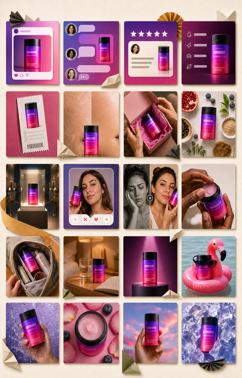
One product URL + photo → 20 square static ads, one per proven format: iMessage conversation, Reddit thread, museum exhibit, dating-app profile, benefits receipt, viral TikTok screenshot and more. An LLM tailors each format to your product facts and packaging, gpt-image-2 renders.
Nodes in this workflow
- Text Prompt×2
- Product from Website
- Upload Image
- Split Text
- Generate Text
- Generate Image
- List Selector
risu
Folding ideas into pixels…